ackbar-snackbar
📦 <ackbar-snackbar>
A small, very easy to use and highly customisable snackbar component to use on any project.
🍕 Try it out on the Ackbar Snackbar Sandbox
📖 Table of Contents
🌈 Installation
npm i ackbar-snackbar
🚀 Getting Started
- Import the module into your project
- You can add it to an html file
<script src="node_modules/ackbar-snackbar/dist/index.js"></script> - or import it on a JS file
import 'ackbar-bar.js';
- You can add it to an html file
- Add the element to your page (for instance as the last element before the
</body>)<ackbar-snackbar></ackbar-snackbar> - To create a snackbar dispatch a
ackbar-snackbar-addevent from any element on your pageconst snackbarOptions = { duration: 4000, message: `This is an awesome snackbar`, variant: 'success' } window.dispatchEvent(new CustomEvent('ackbar-snackbar-add', { bubbles: true, composed: true, detail: snackbarOptions }));
👷♂️ Options
There are several options that you can customize when you create a snackbar.
To set any option, just pass it into the snackbar options object in the ackbar-snackbar-add event. For instance to set a custom animation name:
window.dispatchEvent(new CustomEvent('ackbar-snackbar-add', {
  bubbles: true,
  composed: true,
  detail: {
    message: `This is an awesome snackbar`,
    animationName: 'slide-in',
  }
}));
If an option isn’t passed in the options object, the default value will be used.
Animation Duration
Set the duration of the show and hide animations (in milliseconds).
| Option Name | Default | Type | Required |
|---|---|---|---|
animationDuration |
500 | Number | no |
Example:
// Set custom animation duration
const snackbarOptions = {
  message: 'This is the snackbar message',
  animationDuration: 1000
}
Animation Name
Choose which animation you want to use to show / hide the snackbar
| Option Name | Possible values | Default | Type | Required |
|---|---|---|---|---|
animationName |
‘default’, ‘slide-in’, ‘zoom’ | ‘default’ | String | no |
Example:
// Set custom animation name
const snackbarOptions = {
  message: 'This is the snackbar message',
  animationName: 'slide-in'
}
Button Callback
You can specify a callback function that will be called when the snackbar button is clicked
| Option Name | Default | Type | Required |
|---|---|---|---|
buttonCallback |
null | Function | no |
Example:
// Set a custom callback function
const snackbarOptions = {
  message: 'This is a snackbar message',
  buttonCallback() { console.log('Hello World') }
}
Button Text
Set the text to be displayed on the snackbar button.
| Option Name | Default | Type | Required |
|---|---|---|---|
buttonText |
null | String | no |
Example:
// Set custom button text
const snackbarOptions = {
  message: 'This is a snackbar message',
  buttonText: 'OK'
}
Custom Classes
Add custom classes to the snackbar element
| Option Name | Default | Type | Required |
|---|---|---|---|
customClasses |
null | String | no |
Example:
// Set custom classes
const snackbarOptions = {
  message: 'This is a super cool snackbar message',
  customClasses: 'my-class my-other-class'
}
Duration
Set how long the auto snackbar (refer to type) will be displayed (in milliseconds).
| Option Name | Default | Type | Required |
|---|---|---|---|
duration |
4000 | Number | no |
Example:
// Set custom duration
const snackbarOptions = {
  message: 'This is a snackbar message',
  duration: 8000
}
Hide Callback
You can specify a callback function that will be called when the snackbar hide animation finishes
| Option Name | Default | Type | Required |
|---|---|---|---|
hideCallback |
null | Function | no |
Example:
// Set a custom callback function
const snackbarOptions = {
  message: 'This is a snackbar message',
  hideCallback() { console.log('Snackbar closed') }
}
Message
Set the message that will be shown on the snackbar.
| Option Name | Default | Type | Required |
|---|---|---|---|
message |
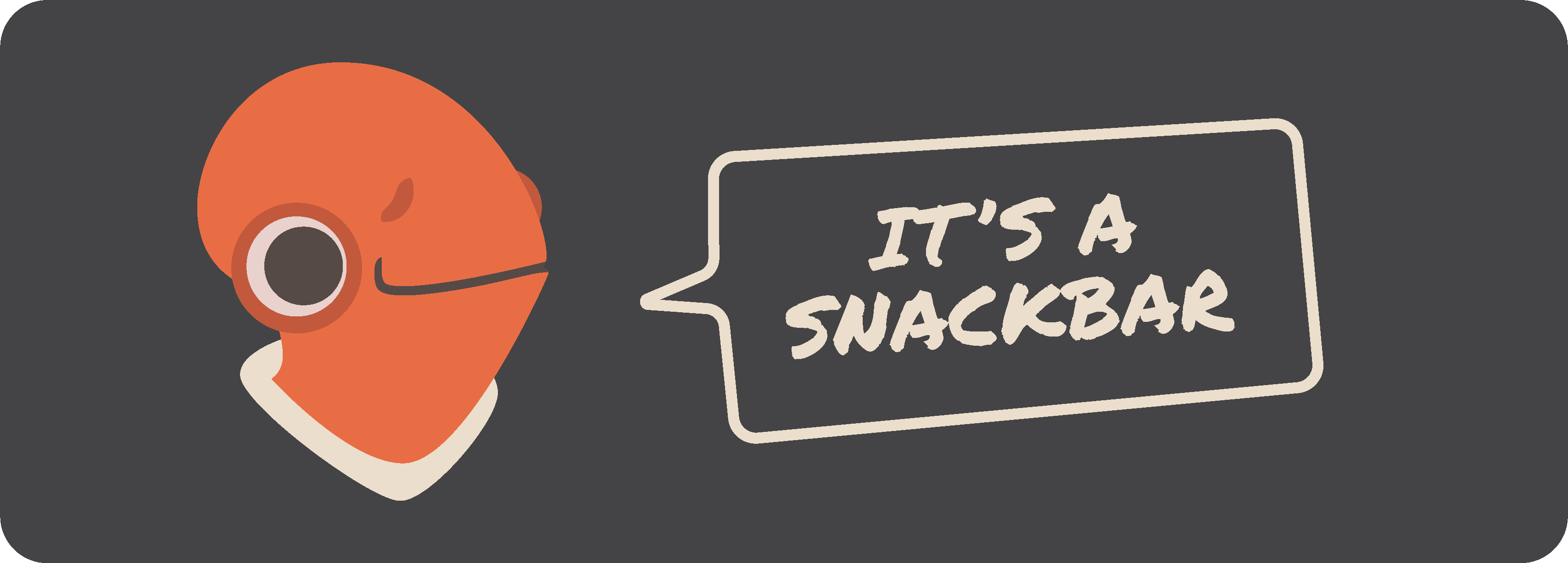
‘Ackbar snackbar: It’s a snackbar’ | String | yes |
Example:
// Set custom duration
const snackbarOptions = {
  message: 'This is a super cool snackbar message',
}
Show Callback
You can specify a callback function that will be called when the snackbar show animation finishes
| Option Name | Default | Type | Required |
|---|---|---|---|
showCallback |
null | Function | no |
Example:
// Set a custom callback function
const snackbarOptions = {
  message: 'This is a snackbar message',
  showCallback() { console.log('Snackbar opened') }
}
Type
Set the type to choose between a snackbar that is automatically dismissed or a snackbar that stays visible until the user clicks the dismiss button.
| Option Name | Possible values | Default | Type | Required |
|---|---|---|---|---|
type |
‘auto’, ‘dismiss’ | ‘auto’ | String | no |
Example:
// Set custom duration
const snackbarOptions = {
  message: 'This is a super cool snackbar message',
  type: 'dismiss'
}
Variant
Choose one of the different snackbar variants to set the snackbar “style” (background-color, …).
| Option Name | Possible values | Default | Type | Required |
|---|---|---|---|---|
variant |
‘default’, ‘success’, ‘warning’, ‘error’, ‘info’ | ‘default’ | String | no |
Example:
// Set custom duration
const snackbarOptions = {
  message: 'This is a super cool snackbar message',
  type: 'dismiss'
}
Size
Set the size of the snackbar
| Option Name | Possible values | Default | Type | Required |
|---|---|---|---|---|
size |
‘small’, ‘normal’, ‘large’ | ‘normal’ | String | no |
Example:
// Set custom duration
const snackbarOptions = {
  message: 'This is a super cool snackbar message',
  size: 'small'
}
✏️ Attributes
You can also set some attributes directly on the element.
Position
Set the position of the snackbars inside the browser window
| Attribute Name | Possible values | Default | Type | Required |
|---|---|---|---|---|
position |
‘top left’, ‘top center’, ‘top right’, ‘middle left’, ‘middle center’, ‘middle right’, ‘bottom left’, ‘bottom center’, ‘bottom right’ | ‘bottom left’ | String | no |
Example:
<!-- set snackbar container position -->
<ackbar-snackbar position="top right"></ackbar-snackbar>
✨ CSS Variables
You can further customize the snackbars by adding your custom styles using the available custom CSS Variables
Example:
/* Add to your css */
acbar-snackbar {
    --ackbar-color-success: green;
}
Variables
| CSS Variable Name | Description | Default |
|---|---|---|
--ackbar-color-bg |
Background color of the default snackbar | rgb(53, 53, 53) |
--ackbar-color-success |
Background color of the success variant snackbar | rgb(105, 199, 109) |
--ackbar-color-error |
Background color of the error variant snackbar | rgb(234, 94, 94) |
--ackbar-color-warning |
Background color of the warning variant snackbar | rgb(241, 153, 78) |
--ackbar-color-info |
Background color of the info variant snackbar | rgb(47, 162, 255) |
--ackbar-color-text |
Message text color on success, error, warning and info variants | rgb(255, 255, 255) |
--ackbar-color-button-default |
Button text color | rgb(149, 104, 228) |
--ackbar-color-button-background |
Button background color | transparent |
--ackbar-color-button-background-hover |
Button background color on hover | rgba(0, 0, 0, .1) |
--ackbar-padding-normal |
Snackbar padding | 1rem |
--ackbar-button-padding |
Padding on the snackbar button | 0.125rem 0.5rem |
--ackbar-spacing-normal |
Spacing between snackbars | .25rem |
--ackbar-margins |
Container’s distance to page border | 1rem |
--ackbar-width |
Snackbar width | 25rem |
--ackbar-max-width |
Snackbar maximal width | calc(100vw - calc(var(–ackbar-margins) * 4)) |
--ackbar-line-height |
Line height | 1.2 |
--ackbar-button-opacity |
Set the button’s opacity | .75 |
--ackbar-button-opacity-hover |
Set the button’s opacity on hover | 1 |
--ackbar-base-font-size |
Base font size for the snackbar elements | 1rem |
--ackbar-radius-normal |
Border-radius (on the snackbar and the button) | .25rem |
--ackbar-opacity |
Opacity of the component | 1 |
--ackbar-grid-gap |
Set gap between the message and the button | 1rem |
--ackbar-box-shadow |
Set the box-shadow on each snackbar | none |